THE ELI HOME, INC.

Feb 2020

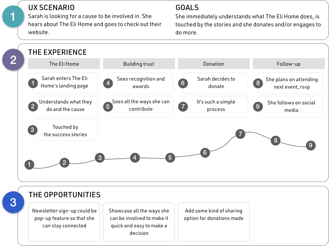
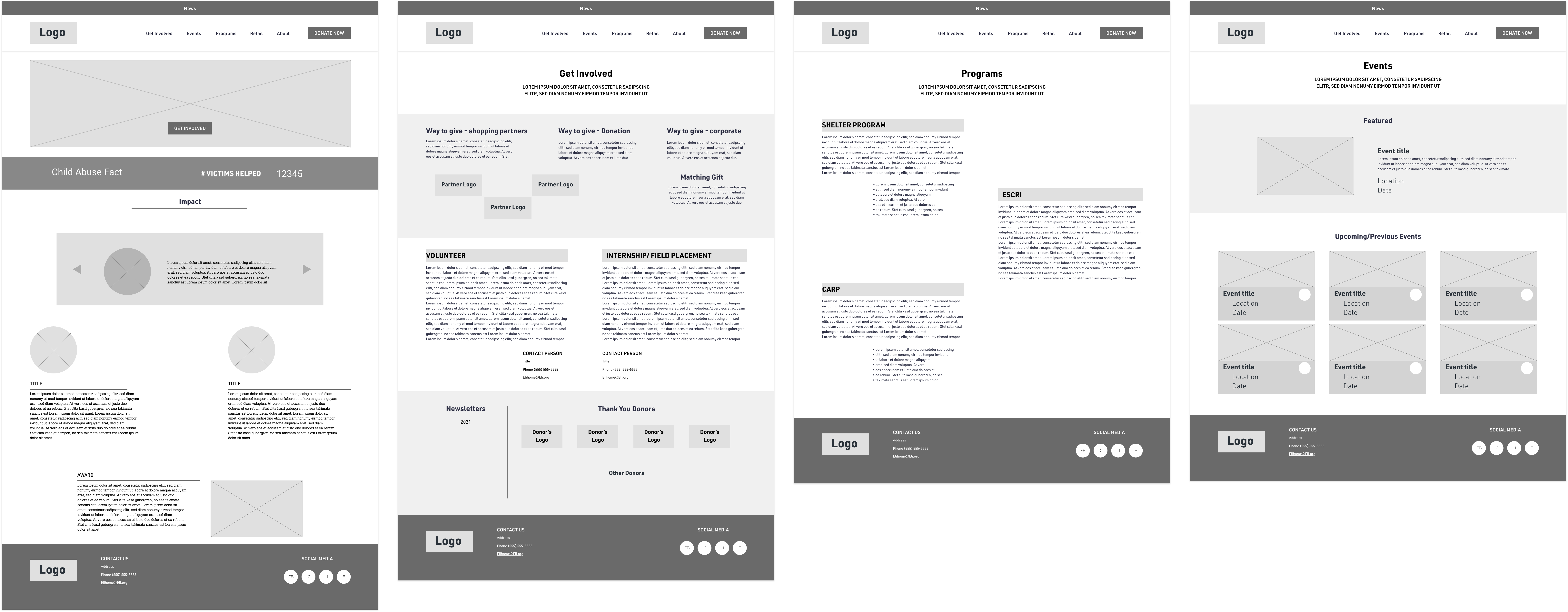
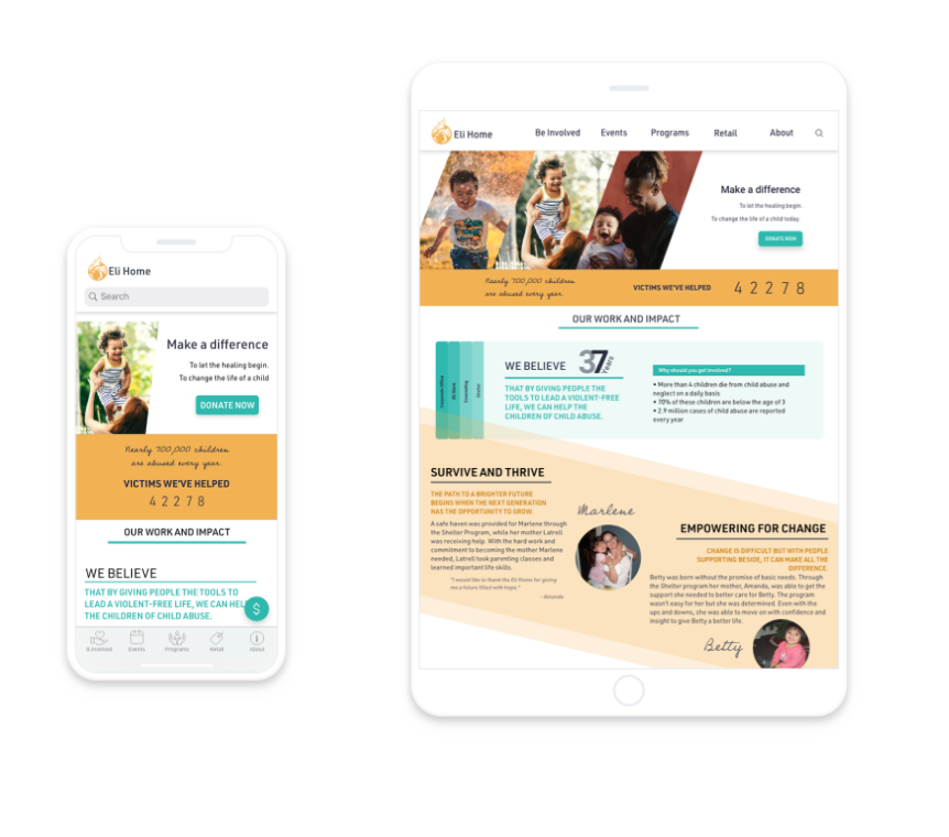
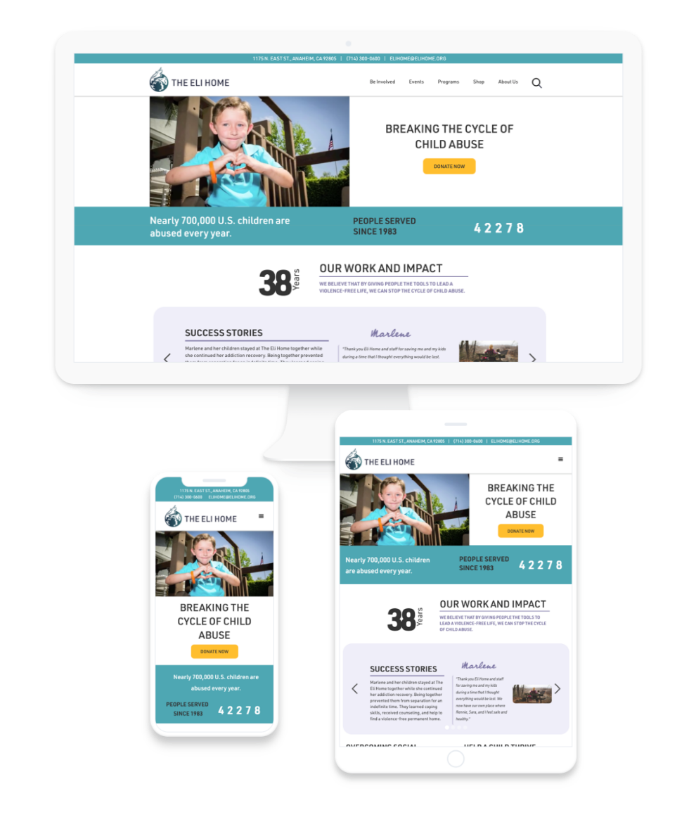
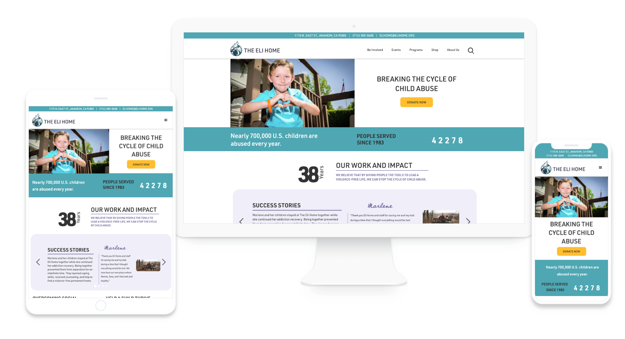
This is a redesign of The Eli Home website to engage users, improve usability, and show professionalism for the nonprofit organization.

CLIENT AND STORY

The Eli Home is a nonprofit that has three main areas of service surrounding children. It is a shelter, provides education, and aids in addiction recovery. Having been in operation for 38 years, they have excelled at what they do and are a pillar in the underserved community they serve.
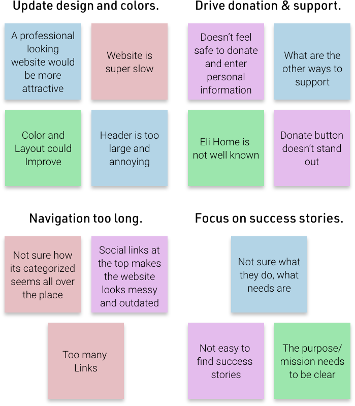
CHALLENGE

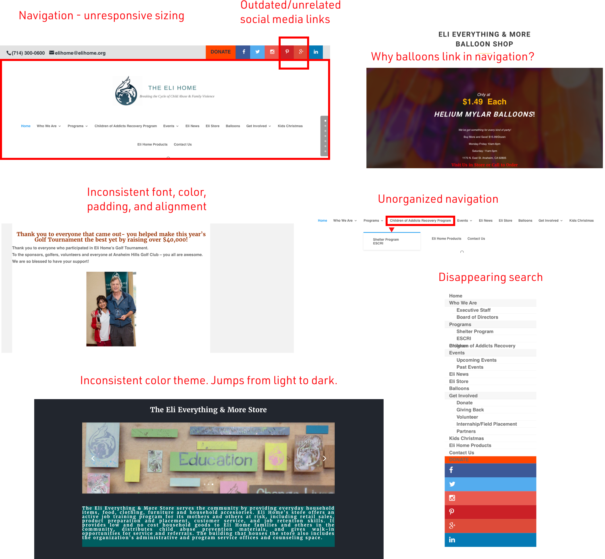
It’s no secret that COVID-19 has profoundly impacted nonprofits. The Eli Home is one among many nonprofits that has had to stay positive despite a challenging operating and fundraising environment with cancelled events and loss of funders/partners. With the shift to a virtual environment, it’s become clear that The Eli Home’s existing website and web presence was deterring potential donors rather than engaging them.

MY ROLE

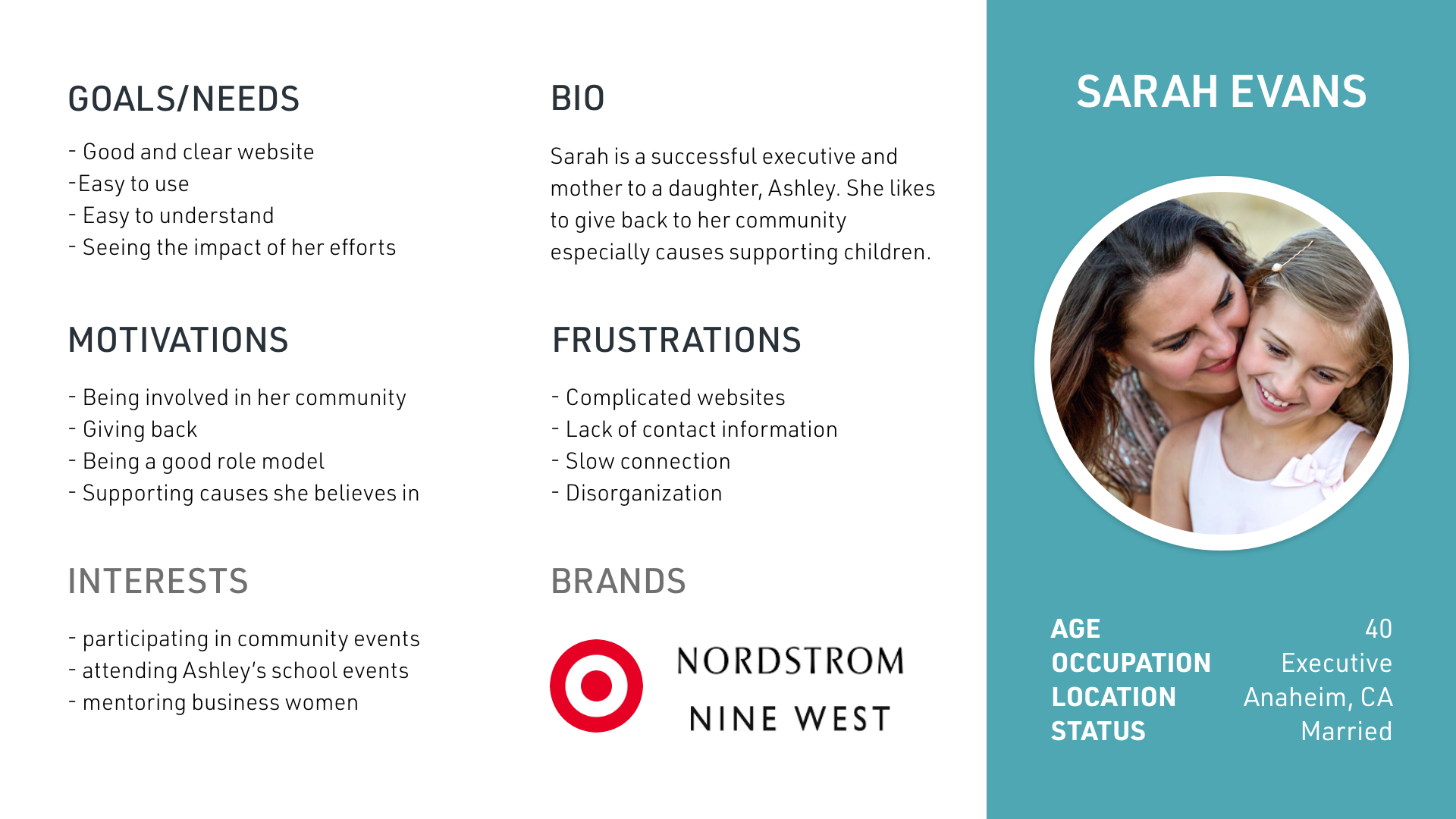
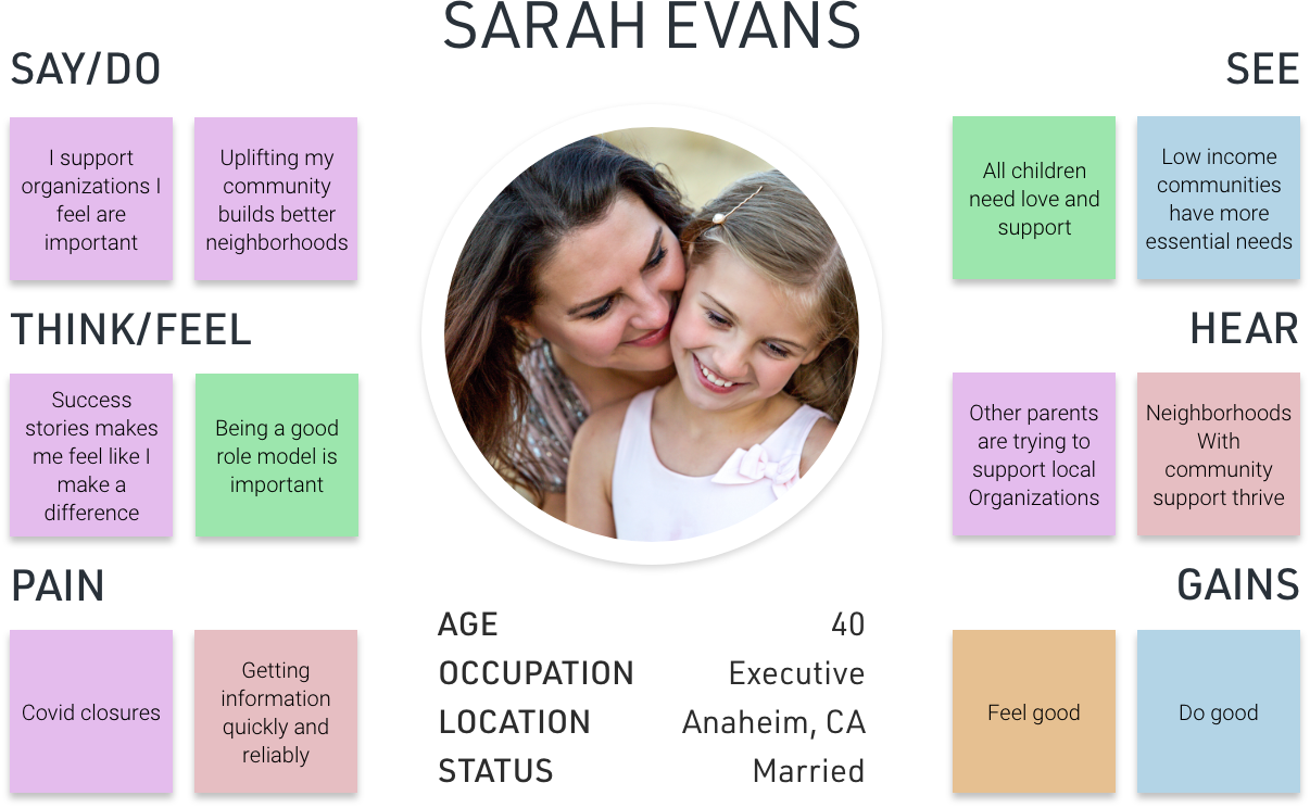
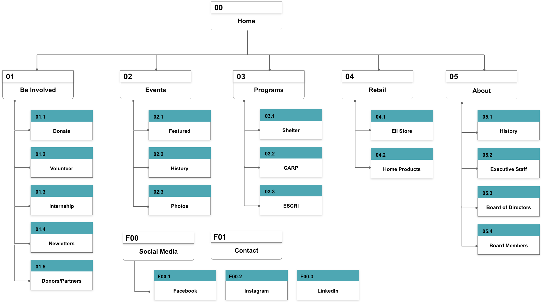
As the UX/UI Designer, I designed the user research to meet the needs of the organization and created the visual design. I also fully developed the website with content management capabilities before handing it off.

The Eli Home responsive mockup on desktop, tablet and mobile.

TOOLS

tools
Step 1 Discover

Heuristic Evaluation

Interview

Proto-persona

Competitor Analysis

Survey

Feedback

Step 2 Define

Affinity Diagram

Empathy Map

User Insight

Problem

Step 4 Deliever

Card Sorting

Site Map

User Journey

Wireframe

Usability Testing

A/B Testing

Iteration

Step 3 Develop

High Fidelity Fidelity

Responsive

Webflow

Third Party Integration

1. Discover

I began with an heuristic evaluation (see Exhibit A) of Eli Home website to detect usability issues. Immediately, there were difficulties trying to navigate. The lack of responsiveness of the navigation obstructed viewing the page’s content. In the mobile, the search icon disappeared altogether.

Aesthetically, both light and dark themes were used sporadically. There didn’t seem to be a cohesive theme in color or font choices and on top of everything else, the loading time was extremely slow. All the issues left the site unengaging, unappealing, and seemingly unprofessional. Overall, there was a lot of room for improvement.

heuristic evaluation of the original Eli Home website.

Upon interviewing Lorri Galloway, the Executive Director, it was indicated that the live fundraising events were integral for bringing in funding for the organization to operate and run their programs. They were now adjusting virtually and realized just how out of date their website was. They didn’t feel it reflect the organization or showcased all the ways people could be involved beyond just donating.

During the interview, Lorri indicated two types of visitors to their website. One were women, typically mothers, who had a shared interest in protecting children and the other were grantors and government entities they would apply for funding from. I put together a proto-persona to begin designing and building for the right audience.

Zoom interview with Lorri Galloway, the Executive Director with The Eli Home.
Proto persona of a typical site vistor. Sarah Eveans is a mother who is involved in her community and tends to contribute to causes invovling children.

I wanted to see what other children oriented nonprofits were doing so I ran a competitive analysis. The first impression of the other nonprofits were positive. I found them to be engaging and the common theme and strength of each nonprofit was that their message was clear and their needs were clear. The Eli Home’s message and needs needed to stand out too.

Other organizations involving children. Social Services, Raise Foundation, The Priority Center, and For the Child.

I approached the public with an online survey through social media asking participants to answer simple questions and complete simple tasks. I wanted to discover what people’s initial reactions to the website were, if they could tell what the organization did, and if they would donate. The top feedback of 20 participants were:

top feedback from survey. General consensus was people were not willing to donate because they didn't find the site to be professional enough.
2. Define

Using an affinity diagram (pictured to the right) to compile all the responses from the survey and interviews allowed me organize the data and hone in on the major issues and area needing resolution.

This lead way to building an empathy map (pictured below) and dive deep into user's behaviors and attitudes.

empathy map
affinity diagram

I could now deduce the user insight.

Users were not likely to trust and donate on a website that wasn’t professional looking and had clear information. I might be able to help improve the trust to drive engagement by improving the navigation, highlighting success stories and rearranging the flow of the website. Doing this will allow users to understand of the needs of the organization and how their donation/involvement can make an impact.

Concluding that the problem is that the existing website does not allow for easy nor appealing access to information, which is causing loss of donation/invovlement from visitors.

2. Define

The first step was to simplify the navigation by card sorting. It was a quick way to reorganize and determine if all the existing link were necessary based on the user and organization needs.

Now a new site map could be created to aid in the designing and content layout.

card sorting image
site map

In order to take a strategic approach to optimize the user experience, Sarah Evans was put through a journey map to see if there were other opportunities.

User Journey Map

I could now wireframe for the new website with ideas for the content and layout. Initial usability testing of the navigation was positive with only slight modifications and changes.

wireframe

Check out the wireframe. Click here.

With the ability to design carte blanche, I took the opportunity to bring in more vibrant colors selected from A/B Testing. I also moved the donate button out of the header and brought in some unique styles in hopes of engaging the audience.

Check out the prototype. Click here.

Once presented, The Eli Home had a better idea of the direction they wanted to take. Some of the initial concepts, like the diagonal sectioning, was just too much. I went back to the drawing board and revised the design to be more traditional. I reimplemented their logo color and provided a few options for colors. Also, instead of having a hero image, they opted for an auto-play video instead.

Check out the revised prototype. Click here.

initial prototype of The Eli Home website.

Working with a nonprofit had challenges, especially during Covid. There were a lot of varying opinions and thoughts to work through. Everyone wanted to have a say so it was important to keep in mind and allow the reasearch to speak for itself.

Having carte blanche was a fun and rare opportunity to be creative; however, I knew my design would be edited so I allowed it to showcase what was possible. It took a lot of testing to finally get the right look, feel, and functionality.

Their trust in me also let me develop the website for them and even moved them from Wordpress to Webflow. With improved content management capabilities, they were thrilled with the possibilities.

With moving their fundraising and other events virtually, they now have a platform that can keep up and really showcase their work and success professionally.

As I wrap up, there may be future opportunities to enhance their volunteer application submission and incoporate a functional form that is fully responsive.

Check out the new and improved The Eli Home website!

Click here

new responsive mockup of The Eli Home website.

Back to Top